
Streamlined Patient Onboarding & Waiting Room
Eliminating patient anxiety through streamlined onboarding and a creative waiting room solution
- Role
- Product Designer & Implementation Lead
- Company
- pMD
- Platforms
- iOS
- Timeline
- Phase 1 (Onboarding): 1 week iOS | 1.5 weeks Android (July 2025) Phase 2 (Waiting Room): 3 weeks iOS | 2 weeks Android (August 2025)
Project Overview
As the design lead for a telehealth platform, I redesigned the patient experience in two phases to eliminate confusion and reduce technical anxiety. This project addressed fundamental challenges in how patients navigate a telehealth app when we have no visibility into their appointment schedules.
The Challenge: Designing in the Dark
Unlike typical telehealth platforms, our system faces a unique constraint: we don't know when patients have appointments. Providers schedule visits in external software, which means:
- We can't send appointment reminders
- We can't provide direct links to specific visits
- We can't tell patients "your appointment is in 15 minutes"
- We have no way to verify if an appointment is running late
This lack of data created significant patient anxiety: "Am I in the right place? Is this working? Did my provider forget about me?"
Phase 1: Streamlined Onboarding
The Problem
The existing onboarding flow created unnecessary friction right at the start:
- Four screens including redundant "almost ready" and "setup complete" messages
- No clear explanation of how the app actually worked
- Help resources buried in settings where patients couldn't find them
- Messages interface showing search bars and compose buttons patients couldn't use
- No "home base" for patients to orient themselves
The Solution
I eliminated the noise and created clarity.
Simplified Flow:
- Reduced from 4 screens to 2: permissions → home (50% reduction)
- Removed confusing "one last step" and "setup complete" screens
- Direct path to understanding and using the app
Redesigned Home Screen:
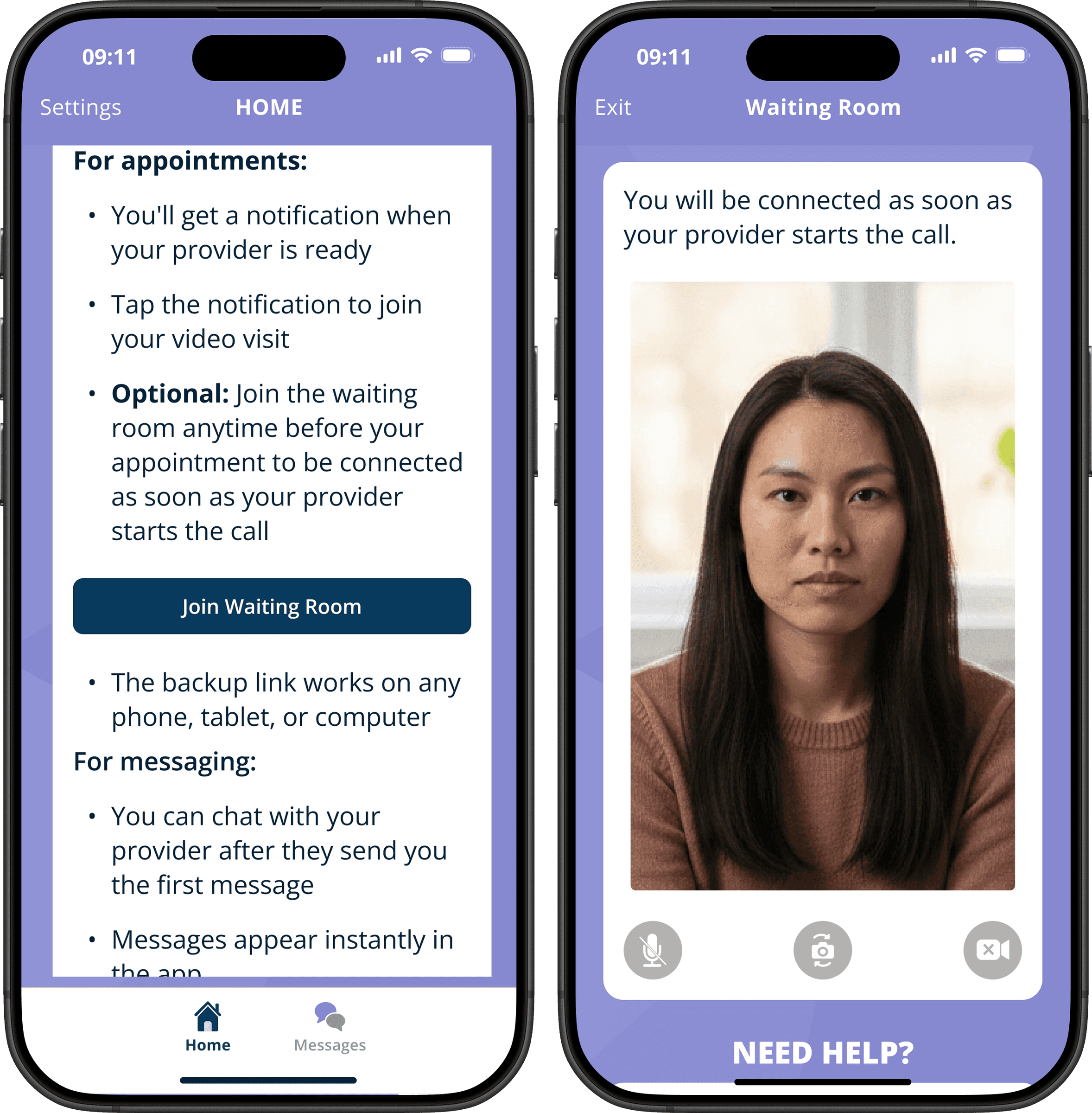
I designed an informative landing page with a pattern background and three white content sections:
- "How it works" - Sets expectations that providers initiate contact
"Your healthcare provider will contact you directly through this app. You don't need to do anything else right now!" - "What to expect" - Details the notification flow and backup links for both appointments and messaging
- "Need help?" - Direct access to Contact Practice, FAQs, and pMD Technical Support
Intelligent Navigation:
- Bottom nav with Home (always visible) and Messages (conditional)
- Messages tab only appears when patient has at least one conversation
- Search functionality hidden until messages exist
- Compose button removed entirely (providers initiate all contact)
- FAQs moved from settings to accessible home screen
Implementation: 1 week iOS | 1.5 weeks Android (design, development, QA)
Why This Mattered
By creating a clear home base, patients immediately understood:
- They were in the right place
- What would happen next
- How to get help if needed
This foundation was critical for Phase 2.
Phase 2: The Waiting Room
The Problem Evolved
Even with better onboarding, patients still experienced significant anxiety before appointments:
- No way to test their camera and microphone beforehand
- Uncertainty about whether they were "ready" for their video visit
- Technical difficulties during critical appointment time
- Camera/mic controls that only worked after both parties joined
- The fundamental question: "Am I in the right place?"
Without appointment data, we couldn't reassure patients with typical solutions like "Your appointment is scheduled for 2:00 PM" or "Dr. Smith will see you shortly."
The Solution: A Creative Approach to Presence
I designed a waiting room that solves a psychological problem, not just a technical one.
The Core Insight: Even though we don't know when appointments are scheduled, we can create a place where patients feel confident they're where they need to be.
Key Features:
- "Join Waiting Room" button prominently placed on the home screen
- Self-view video so patients can see themselves exactly as their provider will
- Fully functional controls (mute/unmute, camera on/off, camera switching) available immediately—not just after joining
- Universal auto-connect: If ANYONE calls that patient while they're in the waiting room, the call is automatically accepted
- Clean, focused interface with no navigation distractions
Platform-Specific Design:
- Mobile: Full-screen immersive experience
- iPad: Split-view with waiting room on the right, allowing patients to view appointment details or messages on the left while waiting
Implementation: 3 weeks iOS | 2 weeks Android (design, development, QA)
Design Decisions
Why Universal Auto-Connect?
Without appointment data, we can't match patients to specific providers or time slots. The solution: if a patient is in the waiting room and any provider calls them, they're connected automatically. This elegantly solves:
- The "did I miss it?" anxiety
- The "do I click the right button?" confusion
- The manual joining delay
It's a blunt instrument, but it works because we trust that if a patient is actively waiting, they're expecting a call.
Why Call It a "Waiting Room"?
The metaphor matters. A waiting room is:
- Where you go before your appointment
- A place that signals "you're here, you're ready"
- Familiar to anyone who's been to a doctor's office
- Inherently temporary—you're not meant to stay forever
Why Show Self-View?
Technical confidence comes from seeing proof. Patients can:
- Verify they're visible and well-framed
- Check their background
- See that their camera is actually working
- Make adjustments on their own timeline
Implementation & Quality Assurance
My Process
As both designer and QA lead, I managed the full cycle from conception to production:
Design Phase:
- Created designs and got approval from leadership to proceed with implementation
- Created detailed specifications for developers
- Defined user flows for all scenarios
- Specified platform-specific requirements for mobile and tablet
- Documented auto-connect logic and control functionality
Development Oversight:
- Coordinated iOS and Android implementation timelines
- Managed parallel workstreams while other projects were in progress
- Ensured consistent behavior across platforms
QA Testing:
- Verified auto-connect functionality worked seamlessly
- Tested camera/mic controls were immediately functional (not just after both parties joined)
- Validated iPad split-view maintained proper aspect ratios
- Confirmed end-call experience properly returned patients to conversation screen
- Tested conditional navigation logic for Messages tab
- Verified helper text updates maintained clarity
The Copy Challenge
While the waiting room solved technical anxiety, we still face a messaging challenge. Patients occasionally call support saying: "My appointment started 10 minutes ago but my provider hasn't called."
Unfortunately, we have no way to:
- Verify when appointments are actually scheduled
- Check if providers are running late
- Communicate with the scheduling system
Future Opportunities:
- Add messaging like "36% of appointments run late" to set realistic expectations
- Gamify the waiting experience (perhaps a calming interaction or helpful pre-visit questions)
- Provide better language around what patients should do if they've been waiting a long time
- Consider a gentle prompt: "Still waiting? Here's how to contact your practice"
This is an area where improved copy and expectation-setting could further reduce support burden.
Results & Impact
Quantitative Wins
- Reduced support tickets for "verify my setup is correct" queries
- Contributed to improved App Store ratings (part of a broader experience improvement)
- Efficient delivery: 5.5 weeks total across both platforms for both phases (while managing parallel projects)
Qualitative Improvements
- Eliminated patient confusion during onboarding
- Reduced technical anxiety through proactive testing capability
- Faster appointment starts via auto-connect (no manual joining delay)
- Improved patient confidence with self-view and working controls
Design Outcomes
- 50% reduction in onboarding screens (4 screens → 2)
- Contextual navigation that adapts to patient needs
- Accessible help resources moved from buried settings to home screen
- Novel solution to "invisible appointments" constraint
Reflection & Learnings
What Worked Well
Designing for Constraints:
Rather than fighting against the lack of appointment data, I designed around it. The waiting room doesn't need to know when appointments are—it just needs to make patients feel prepared and positioned correctly.
Phased Approach:
Building the home screen foundation first (Phase 1) gave patients a clear mental model before introducing the waiting room concept (Phase 2). The sequence mattered.
Cross-Platform Consistency:
Managing both iOS and Android implementations ensured patients had a consistent experience regardless of device, while still respecting platform-specific patterns like iPad split-view.
Integrated Design-QA Role:
Wearing both hats allowed me to catch edge cases early and ensure the implementation matched the intended experience.
What I'd Improve
Copy Iteration:
There's still work to be done on messaging for patients who've been waiting longer than expected. Setting realistic expectations upfront could prevent frustration.
Provider Communication:
Future iterations should explore how providers are notified when patients join the waiting room, creating visibility in both directions.
Metrics & Validation:
I wish I'd established clearer success metrics before implementation—measuring average wait times, drop-off rates, and correlation with support ticket reduction would strengthen the case.
If I Had More Time
- Waiting experience enhancements: Progress indicators, calming content, or pre-visit questionnaires
- Smart messaging: Context-aware copy that adjusts based on wait time
- A/B testing: Different messaging approaches for the "still waiting" scenario
- Audio test feature: Recorded playback so patients can verify they're audible
Key Takeaway
This project taught me that good design doesn't always mean having perfect data—it means designing solutions that work within real-world constraints.
We couldn't tell patients when their appointments were, but we could give them:
- A place that feels right
- Tools that work when they need them
- Confidence that they're prepared
By reframing the problem from "how do we manage scheduled appointments?" to "how do we reduce anxiety when we can't see the schedule?", we created a solution that worked with our limitations rather than against them.
The insight: Sometimes the best solution isn't more data—it's better psychology.